Sharing and Publishing
In this workshop we cover using GitHub for sharing your source code, Git for version control, and Quarto for publishing outputs. Specifically, we look at:
- How to create code-dependent documents, dashboards and presentation using Quarto
- How to create a Git repository on GitHub and add files to it
- How Git can help record a clean history of a project and collaborate with others
- How Git and GitHub integrate with different tools
Quarto
Quarto is a publishing system that allows creating documents, presentations, websites and dashboards that contain prose, code and code outputs. This means that such outputs can detail exactly what happened to the data, and outputs can be re-generated very quickly if, for example, the underlying dataset was updated, or if the analysis needs to change.
Let’s create a document using some of the syntax we learned in previous sessions.
Use “New File > Quarto Document…” to create a .qmd file. The dialog that open allows us to change a few settings. Let’s give the title “Reproducible Output”, and untick “Use visual markdown editor” so we can learn about the syntax. Save the new file in your project directory.
This new .rmd script will be made of markdown text and code chunks. Code chunks can be inserted with the editor pane’s toolbar or the keyboard shortcut Ctrl+Alt+I.
At the top of our script, we need to include a header (also called “front matter”) that contains the document’s settings. We can start with:
---
title: Reproducible Output
author: Your Name
date: 2025-01-01
---
The rest of the document will be a mix of markdown-formatted prose and executable code chunks. For example:
## Import the data

Let's **import** the data:

```{r}
players <- read.csv("data_sources/Players2024.csv")
```

## Prepare the data

Remove missing position and ensure **reasonable heights**:

```{r}
library(dplyr)
players <- players %>% filter(positions != "Missing", height_cm > 100)
```

## Plot the data

A boxplot of player **height by position**:

```{r}
library(ggplot2)
ggplot(players, aes(x = positions, y = height_cm)) +
  geom_boxplot() +
  labs(x = "Position", y = "Height (cm)")
```
Outside the code chunks, we use the Markdown markup language to format the text. For example, using ## before some text defines a heading of level 2 (level 1 being the document’s title), and using ** around some text makes it bold. See more Markdown hints in the Quarto documentation.
Rendering
To render the document and see the result, use the “Render” button in the source pane toolbar.
This should create a HTML document in your project directory, which you can open in a web browser by clicking it and choosing “View in web browser” (if it is not opened automatically already). The file can be left open and will automatically update in your browser when the document is rendered again.
As the default Quarto output is a HTML file, we can include interactive visualisations too.
Cell options
If you want to show the code but don’t want to run it, you can add the cell option #| eval: false. And if you want to show the output but not show the underlying code, use #| echo: false.
## Interactive plots

We need plotly. If you need to install it:

```{r}
#| eval: false
install.packages("plotly")
```

An interactive scartterplot:

```{r}
#| title: Age vs Height
#| echo: false

p <- ggplot(players, aes(x = age, y = height_cm, colour = positions, label = name, label2 = nationality)) +
  geom_point() +
  facet_wrap(vars(positions)) +
  labs(x = "Age", colour = "Position", y = "Height (cm)")
library(plotly)
ggplotly(p)
```
And for adding a caption and alternative text to a figure, we can modify our boxplot chunk as follows:
```{r}
#| fig-cap: "Goalkeepers tend to be taller."
#| fig-alt: "A boxplot of the relationship between height and position."
library(ggplot2)
ggplot(players, aes(x = positions, y = height_cm)) +
  geom_boxplot() +
  labs(x = "Position", y = "Height (cm)")
```
Many more cell options exist, including captioning and formatting visualisations. Note that these options can be used at the cell level as well as globally (by modifying the front matter at the top of the document).
For example, to make sure error and warning messages are never shown:
---
title: Reproducible Output
author: Your Name
date: 2025-01-01
warning: false
error: false
---
Output formats
The default output format in Quarto is HTML, which is by far the most flexible. However, Quarto is a very versatile publishing system and can generate many different output formats, including PDF, DOCX and ODT, slide formats, Markdown suited for GitHub… and even whole blogs, books and dashboards.
Let’s try rendering a PDF:
---
title: Reproducible Output
author: Your Name
date: 2025-01-01
format: pdf
---
When rendering PDFs, the first issue we might run into is the lack of a LaTeX distribution. If Quarto didn’t detect one, it will suggest to install tinytex (a minimal LaTeX distribution) with this terminal command:
quarto install tinytexOnce that is installed, Quarto should render a PDF.
Another issue with our example document is that an interactive HTML visualisation won’t be rendered in the PDF. You can suppress it by using the #| eval: false option:
```{r}
#| title: Age vs Height
#| echo: false
#| eval: false
p <- ggplot(players, aes(x = age, y = height_cm, colour = positions, label = name, label2 = nationality)) +
geom_point() +
facet_wrap(vars(positions)) +
labs(x = "Age", colour = "Position", y = "Height (cm)")
library(plotly)
ggplotly(p)
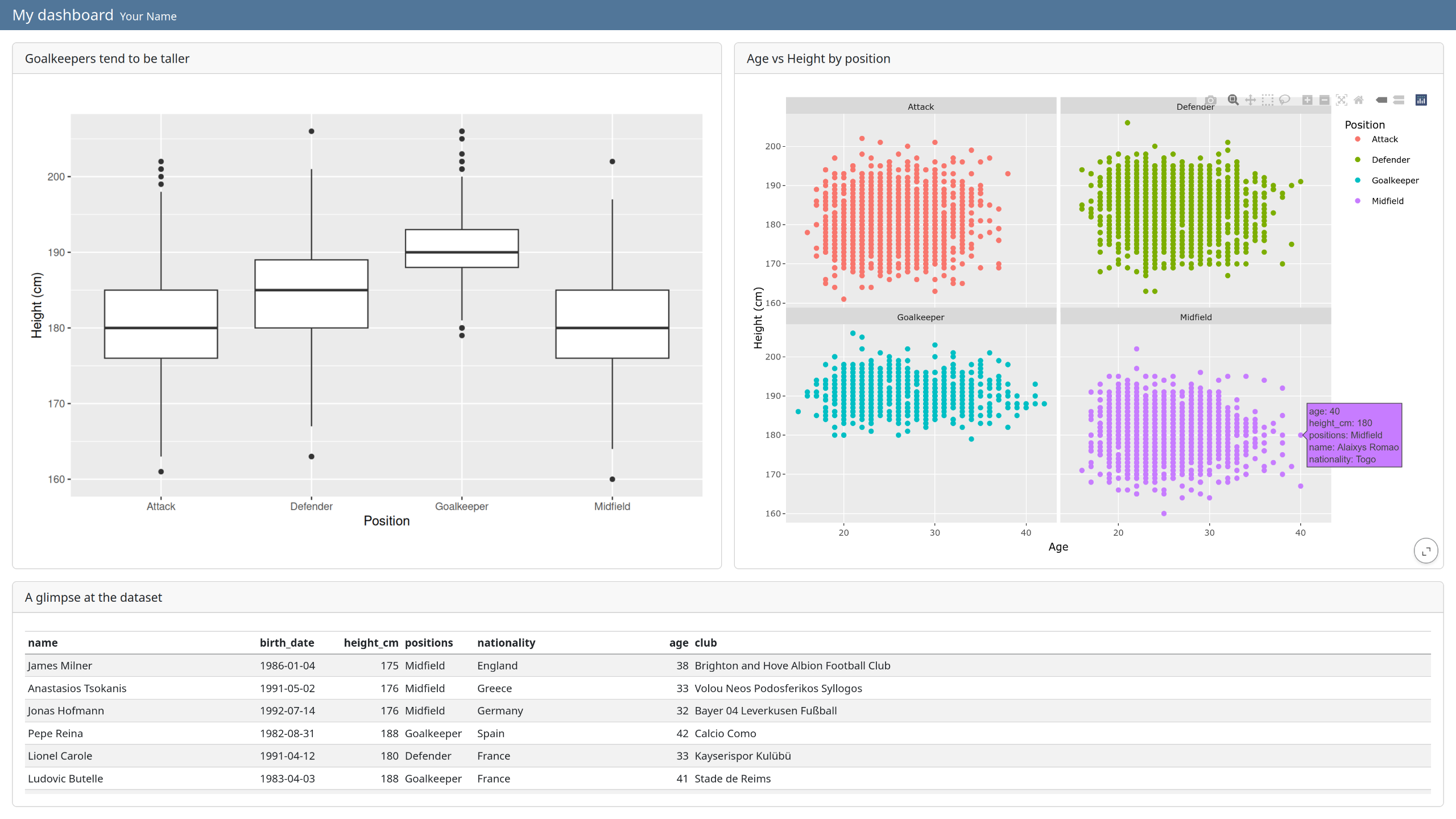
```Dashboard
A great way to present a variety of outputs in a grid is by creating a HTML dashboard.
Let’s modify our script to render a dashboard. First, change the output format:
---
title: Reproducible Output
author: Your Name
date: 2025-01-01
format: dashboard
---
We can already render the dashboard and see the result. Each panel can be expanded with the bottom-right button. Note that by default:
- each cell is rendered in a separate card
- headings define the rows
- the heading text is discarded
- code is not shown (but can be by using
echo: true)
Given this default behaviour, you might have to rethink a good part of your script to make it suited for a striking dashboard. For example, removing most of the text, customising the layout (tabsets, rows, card heights…) and adding custom cards like “value boxes”. Learn more about all these in the Quarto Dashboards documentation.
As a starting point, copy the current script across to a new script called dashboard.rmd and modify it so it matches the following:
---
title: "My dashboard"
author: Your Name
date: 2025-01-01
format: dashboard
warning: false
---

```{r}
players <- read.csv("data_sources/Players2024.csv")
```

```{r}
library(dplyr)
players <- players %>% filter(positions != "Missing", height_cm > 100)
```

## Figures {height=70%}

```{r}
#| title: Goalkeepers tend to be taller
#| fig-alt: "A boxplot of the relationship between height and position."
library(ggplot2)
ggplot(players, aes(x = positions, y = height_cm)) +
  geom_boxplot() +
  labs(x = "Position", y = "Height (cm)")
```

```{r}
#| title: Age vs Height by position
p <- ggplot(players, aes(x = age, y = height_cm, colour = positions, label = name, label2 = nationality)) +
  geom_point() +
  facet_wrap(vars(positions)) +
  labs(x = "Age", colour = "Position", y = "Height (cm)")
library(plotly)
ggplotly(p)
```

## Table

```{r}
#| title: A glimpse at the dataset
library(knitr)
kable(players)
```
This results in a dashboard containing three cards organised in two rows. The top row uses 70% of the available height, and the bottom row shows a table of the top 10 rows of the dataset. Each card has a title.
Git and GitHub
Git is a version control system that allows to record a clean history of your project, track precise authorship, and collaborate asynchronously with others. It can be used offline, from the command line or with integration into Itegrated Desktop Environments (like RStudio, VS Code… Unfortunately, Spyder does not have Git integration).
GitHub is one of many websites that allow you to host projects that are tracked with Git. But even without using Git at all, it is possible to use GitHub to share and make your project public. Many researchers use it to make their code public alongside a published paper, to increase reproducibility and transparency. It can also be useful to build and share a portfolio of your work.
Learning about the ins and out of Git takes time, so in this section we will mainly use GitHub as a place to upload and share your code and outputs, and as a starting point for learning more about Git in the future.
GitHub
GitHub is currently the most popular place for hosting, sharing and collaborating on code. You can create an account for free, and then create a repository for your project.
- Create an account and log in
- Click on the “+” button (top right of the page)
- Select “New repository”
- Choose a name and description for your repository
- Tick “Add a README file” - this will be where you introduce your project
- Click “Create repository”
From there, you can upload your files, and edit text-based files straight from your web browser if you need to.
The README file is a markdown file that can contain the most important information about your project. It’s important to populate it as it is the first document most people see. It could contain:
- Name and description of the project
- How to use it (installation process if any, examples…)
- Who is the author, who maintains it
- How to contribute
For inspiration, see the pandas README file.
To practice managing a git repository on GitHub, try creating a personal portfolio repository where you can showcase what you have worked on and the outputs your are most proud of.
Further resources
- Some alternatives to GitHub: Codeberg and Gitlab
- Quarto documentation
- Course on Git from the command line
- Course on Git with GitHub
- Book on Git for R and RStudio users, by Jenny Bryan